A vital aspect of science communication is effective data visualization. To grant new insights and push our data visualization skills, we invited speakers Cédric Scherer and Marco Piani in our colloquium.
Cédric Scherer holds a PhD in Ecology and works as an independent data visualization designer next to his post-doctoral work ar the Department of Ecological Dynamics, Institute for Zoo and Wildlife research, Berlin. Cédric provided an in depth primer of engaging and effective gaphical storytelling.
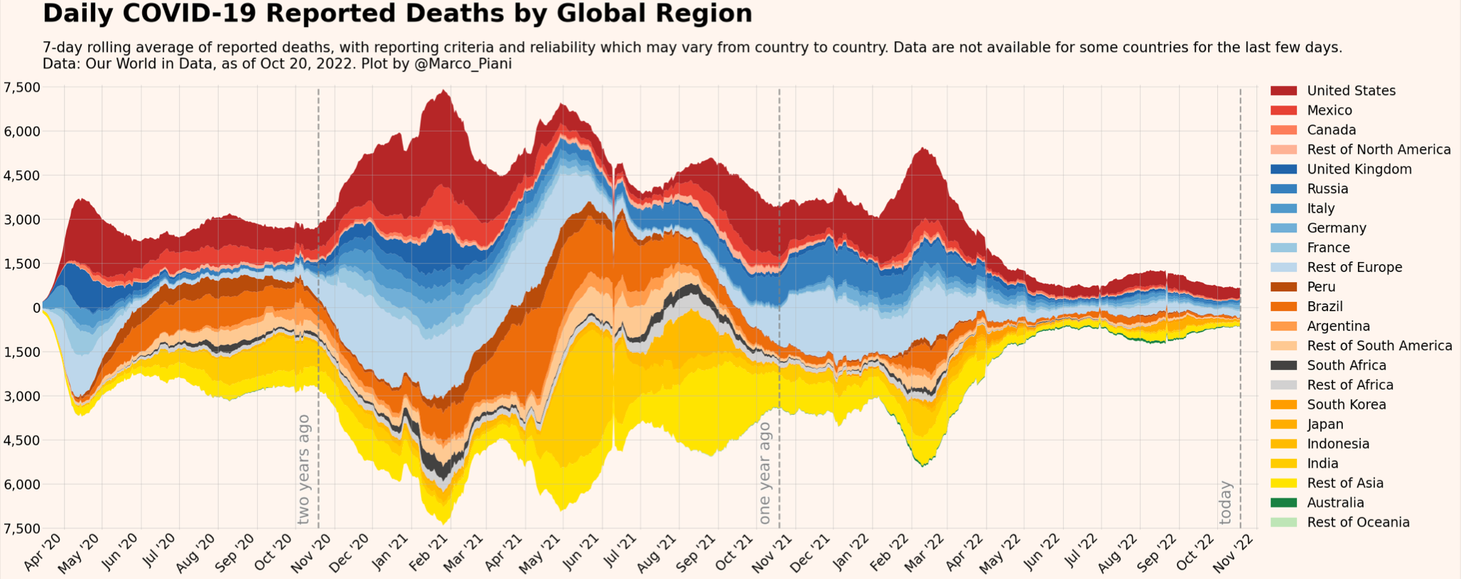
Following Cédrics talk, Marco Piani lead an hands-on tutorial on data visualization with Python. Marco, a physicist by training, gained Twitter fame during the past years with his COVID-related graphs.